[ Olive - Health and Wellbeing App ]
A simple, all-in-one platform designed to help busy adults manage their health without juggling multiple apps.
ROLE
UX designer
DURATION
3 months

APPROACH
[ Reducing friction,
not adding features]
Olive was designed to reduce the friction of managing health across multiple disconnected tools.
The focus was on simplifying interactions and making essential tasks easy to access without adding complexity.
-
Reduce reliance on multiple apps
-
Prioritise clarity and simplicity
-
Enable quick, repeatable actions
SOLUTIONS
Three decisions that shaped the design

SOLUTION 01
Simplified structure
A centralised layout brings key actions into one place, reducing the need to navigate between sections.

SOLUTION 02
Clear navigation & hierarchy
Primary actions are prioritised visually, making it easier for users to understand where to go and what to do next.
SOLUTION 03
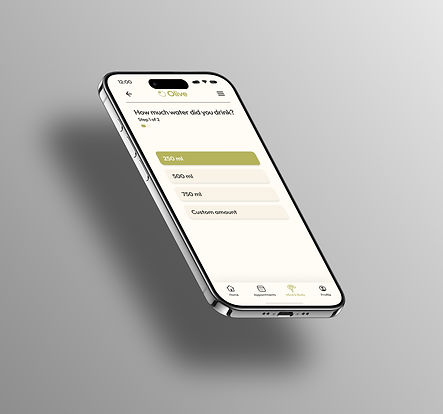
Reduced interaction steps
Core flows were streamlined to minimise effort and support regular use
OUTCOMES
[ A more intuitive experience]
The final design creates a more intuitive and streamlined experience, making everyday health tasks easier to maintain.
-
Improved visibility of key actions
-
Reduced steps in core flows
-
More intuitive navigation
OUTCOMES
NEXT STEPS
Simplicity as the challenge
This project highlighted how critical simplicity is in health-focused design.
The challenge wasn't adding features, but removing friction.
-
Test long-term engagement and habit formation
-
Refine onboarding experience
-
Expand testing with a broader user group